





10 Beautiful Purple Color Palettes for Modern UI Design (With HEX Codes)
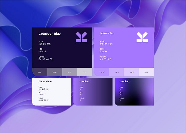
Purple has quietly become one of the most versatile colors in modern interface design.
Once associated mainly with creativity and luxury, today’s purple palettes are softer, cleaner, and surprisingly flexible. They’re now widely used across SaaS products, AI startups, fintech platforms, wellness brands, and creative portfolios because they balance professionalism with personality.
The secret isn’t using bright purple.
It’s choosing the right shade.
Below are ten UI-ready purple palettes that work beautifully for websites, dashboards, and mobile applications.
1. Lavender SaaS
Perfect for AI products and startup landing pages.
| Role | Color |
|---|---|
| Primary | #7C3AED |
| Secondary | #A78BFA |
| Background | #F8F7FF |
| Surface | #FFFFFF |
| Text | #1F2937 |
Works well for:
- AI products
- SaaS
- Productivity apps
2. Premium Violet
Elegant without feeling overly corporate.
| Role | Color |
|---|---|
| Primary | #5B21B6 |
| Secondary | #8B5CF6 |
| Background | #FAFAFC |
| Surface | #FFFFFF |
| Text | #111827 |
Best suited for luxury brands, fashion, wellness, and premium services.
3. Soft Lilac
Minimal and calming.
| Role | Color |
|---|---|
| Primary | #8B5CF6 |
| Secondary | #C4B5FD |
| Background | #FCFBFF |
| Surface | #FFFFFF |
| Text | #374151 |
Ideal for healthcare, meditation, beauty, and lifestyle websites.
4. Midnight Purple
Dark mode lovers will appreciate this one.
| Role | Color |
|---|---|
| Primary | #6D28D9 |
| Secondary | #A855F7 |
| Background | #0F172A |
| Surface | #1E293B |
| Text | #F8FAFC |
Excellent for dashboards and developer tools.
5. Indigo Blend
A balance between blue and purple.
| Role | Color |
|---|---|
| Primary | #6366F1 |
| Secondary | #8B5CF6 |
| Background | #F9FAFB |
| Surface | #FFFFFF |
| Text | #1E293B |
A safe choice for fintech products and enterprise software.
6. Purple & Peach
Warm and approachable.
| Role | Color |
|---|---|
| Primary | #7E22CE |
| Accent | #FDBA74 |
| Background | #FFF8F5 |
| Surface | #FFFFFF |
| Text | #312E81 |
Perfect for creators and personal brands.
7. Electric Purple
Bold but controlled.
| Role | Color |
|---|---|
| Primary | #9333EA |
| Accent | #06B6D4 |
| Background | #F8FAFC |
| Surface | #FFFFFF |
| Text | #111827 |
A great fit for startups looking for a memorable visual identity.
8. Dusty Purple
Muted colors are becoming increasingly popular in UI design.
| Role | Color |
|---|---|
| Primary | #7E69AB |
| Secondary | #B8A9D9 |
| Background | #FBFAFD |
| Surface | #FFFFFF |
| Text | #374151 |
Ideal for editorial websites and digital magazines.
9. Purple Gradient
Combine these two colors for a modern hero section.
Start → #8B5CF6
End → #4F46E5
Works especially well with large typography and clean layouts.
10. Deep Plum
A sophisticated palette for premium experiences.
| Role | Color |
|---|---|
| Primary | #581C87 |
| Secondary | #A855F7 |
| Background | #FCFCFD |
| Surface | #FFFFFF |
| Text | #111827 |
Great for luxury ecommerce, interior design, and boutique agencies.
Tips for Using Purple in UI
- Pair purple with neutral grays instead of pure black.
- Use white space generously to prevent the interface from feeling heavy.
- Reserve brighter shades for primary actions such as buttons and links.
- Test every text combination against WCAG accessibility standards.
- Limit gradients to hero sections or illustrations rather than entire interfaces.
Purple remains one of the easiest colors to modernize a digital product—provided it’s used with restraint. A thoughtful palette creates interfaces that feel premium, contemporary, and approachable without overwhelming the user.


