

UI Design in 2026: Why Color Is Becoming the Most Powerful Branding Tool
Category: Design News
For years, user interface design was driven by minimalism.
Neutral palettes, monochromatic layouts, and subtle accents dominated websites and mobile apps. Clean design became synonymous with good design.
But 2026 is telling a different story.
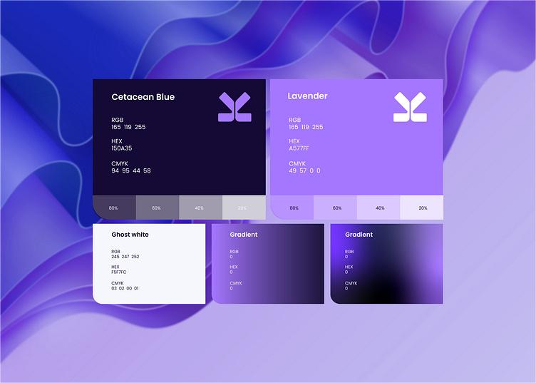
Designers are embracing color once again—not as decoration, but as a strategic branding tool. Across SaaS platforms, AI products, fintech apps, and consumer websites, bold yet carefully balanced color systems are helping brands stand out in an increasingly crowded digital landscape.
The shift isn’t about making interfaces louder.
It’s about making them more memorable.
From Minimal to Memorable
Over the last decade, many digital products started to look remarkably similar.
White backgrounds.
Rounded cards.
Soft shadows.
Blue buttons.
The result was a generation of interfaces that were easy to use—but often difficult to distinguish.
Today’s designers are responding by building stronger visual identities through color. Instead of relying on generic UI patterns alone, they’re creating unique palettes that users can instantly associate with a brand.
Think about how quickly you recognize the colors of Spotify, Notion, Duolingo, or Stripe—even before reading their names.
Color has become part of the product experience.
AI Is Accelerating Design Decisions
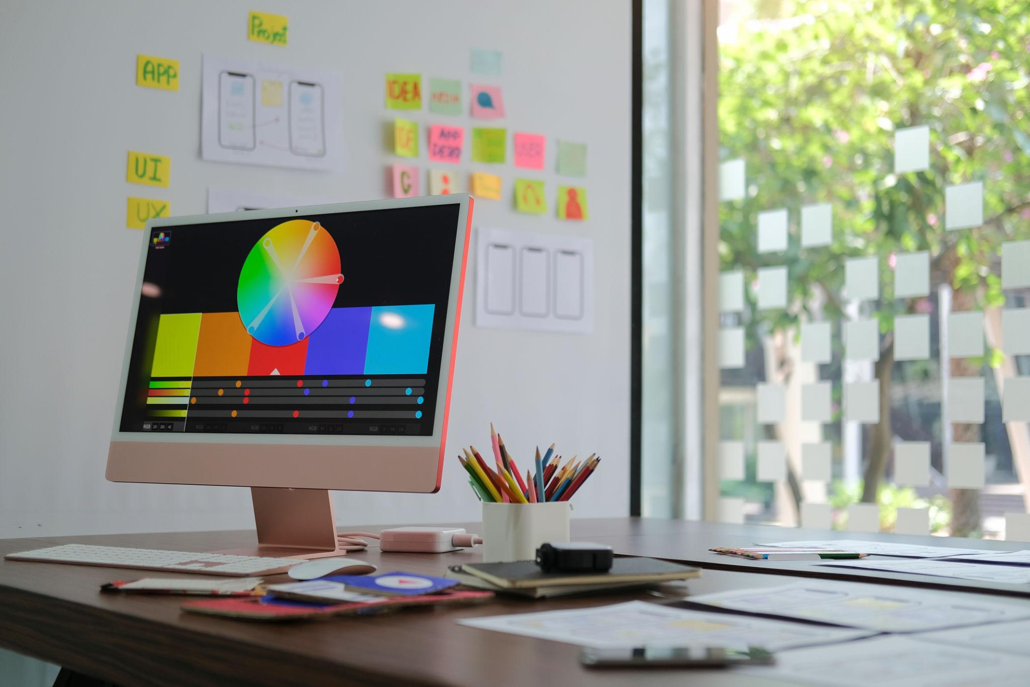
The rise of AI-powered design tools has also changed the way color palettes are created.
Instead of manually testing dozens of combinations, designers can now generate harmonious palettes, preview accessibility scores, and explore multiple visual directions within minutes.
This doesn’t replace creativity.
It simply gives designers more time to focus on what matters most: creating interfaces that communicate personality while remaining functional.
As AI streamlines repetitive tasks, color strategy is becoming a more intentional part of the creative process.
Accessibility Is No Longer Optional
Another reason color is receiving renewed attention is accessibility.
Design systems today are expected to work for everyone, including users with visual impairments or color vision deficiencies.
A beautiful palette is no longer enough.
Designers are increasingly evaluating contrast ratios, readability, and consistency before a product goes live.
The most successful interfaces aren’t just visually appealing—they’re inclusive by design.
The Return of Personality
Perhaps the biggest design trend of 2026 isn’t a specific color.
It’s confidence.
Brands are moving away from playing it safe.
Muted greens, rich purples, warm oranges, modern earth tones, and expressive gradients are appearing across industries that once relied almost exclusively on blue.
The goal isn’t to follow trends.
It’s to create an emotional connection.
When color is used thoughtfully, it helps users remember a product long after they’ve closed the browser.
Looking Ahead
As digital products continue to compete for attention, visual identity will become even more important.
Typography, motion, and layout all contribute to the user experience—but color is often the first thing people notice and the last thing they remember.
In 2026, successful interfaces won’t simply look modern.
They’ll feel recognizable.
And increasingly, that recognition will begin with color.